Apple’s HCI Guidelines have long been a document to refer to when designing the GUI for a new piece of software. I like their drag-and-drop tools for creating Cocoa applications. The little helper lines really can help create a more pleasant-looking piece of software.
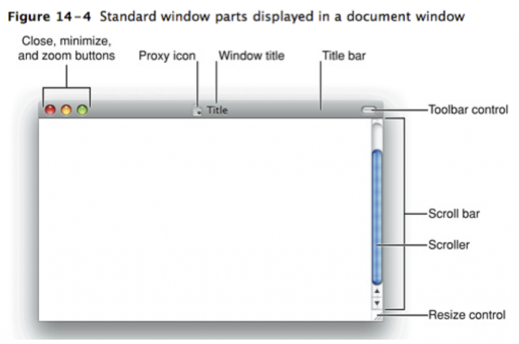
So why does Apple violate its own rules with iTunes? I don’t know why this irritates me so much, but it irks me every time I open iTunes. This is an excerpt from their guidelines of what a generic window should look like:
And this is what the iTunes window looks like:
Notice the difference in the max/min/close buttons? Â Why would you make this change? (And I don’t know when this change was made, I only noticed it in iTunes 10, perhaps it’s been like this forever.)
When you train the users of your OS to expect certain functionality to be consistently placed within an application – and then even publish why and how that should occur – why break your own rules? I just don’t see any clear benefit (and “cleaner lines” at the sacrifice of usability is not a benefit).

