Creativeworks London Project – Iteration 2

This is the second in a series of posts documenting a project funded by an Entrepreneur-in-Residence Award from Creativeworks London. See an earlier post for the first design iteration.

After working with the laser cutter and inkjet printer to bring some initial ideas to a physical form, I was ready to move on to the 3D printer. The Materials Processing Lab at Queen Mary has a Objet30 Prime which is printer that builds up a liquid layer of material that is then UV cured. It can print 16-28 microns per layer, depending the material being printed.

3D Printed Buttons

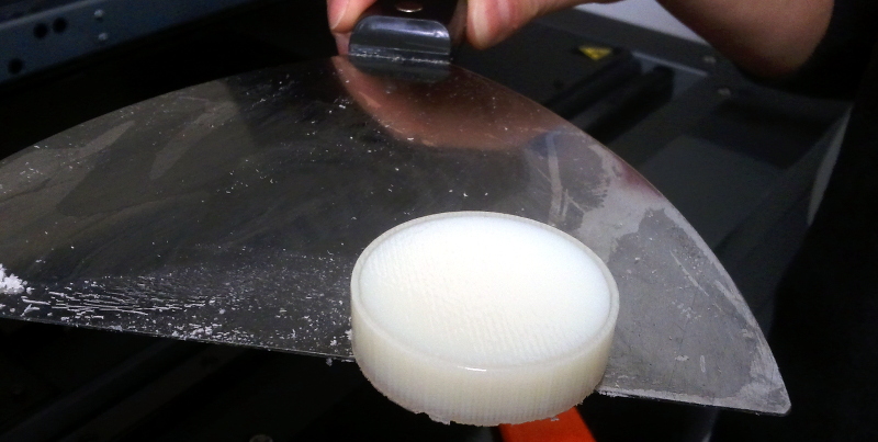
The biggest barrier to the 3D printer for me was learning how to create a model. I worked with AutoCAD and managed to learn enough from online tutorials to get what I wanted. I started by creating a solid cylinder, seen below in a hard white plastic, surrounded by a translucent material printed as a support structure.

Test print

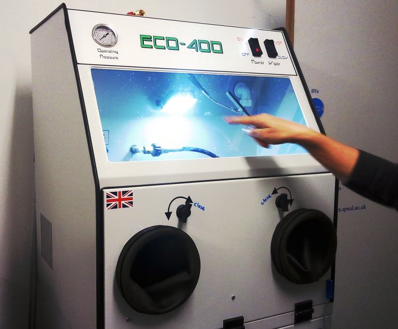
The support material is washed away in a power washing station. The station has a staggering number of significant design flaws, but its little automatic windshield wiper makes it endearing.

Washing station

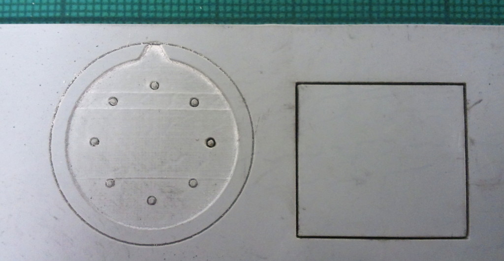
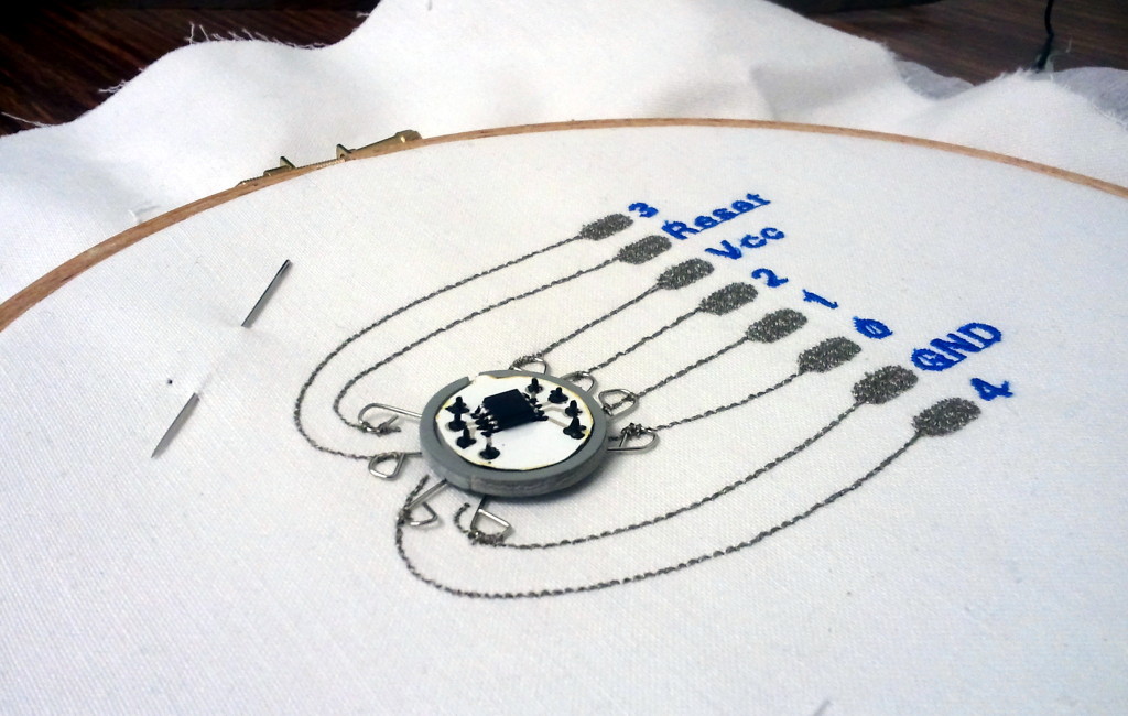
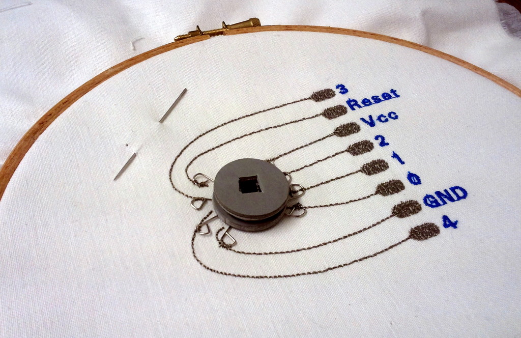
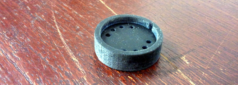
The initial printed design was a 3D interpretation of the laser cutter layout. Eight holes were printed in a cylinder with a recessed circle so that it could hold both a PCB and contacts to reach the pins. A notch was included to allow the inserted PCB to fit in only one way. This initial print can be seen below. It is created with Tangoblack FLX973, a flexible, rubber-like material. It was printed with a matte finish, an effect caused by being printed with the support material fully encasing the object.

3D printed button, matte finish

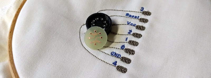
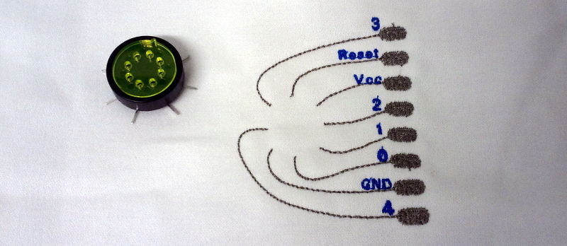
The first change made to the design was the position and size of the holes for the contacts. The first design iteration used sewing straight pins as contacts, which were handy for a very quick and dirty proof of concept, but certainly not ideal for anything more robust than that. After hunting through electronic component catalogues, I came across turned pin header sockets used for wire wrapping. The long legs of the sockets gave plenty of clearance to bend the legs out from under the button and reach the conductive thread of the embroidered circuit. The legs could then be hand-sewn with conductive thread.

The design change was to equally distribute the sockets around the PCB/button in a circle, as opposed to two arced groupings. This provided the maximum distance between the contacts and made it easier to create design files in multiple software packages for the different prototyping processes.

Print with black rubber

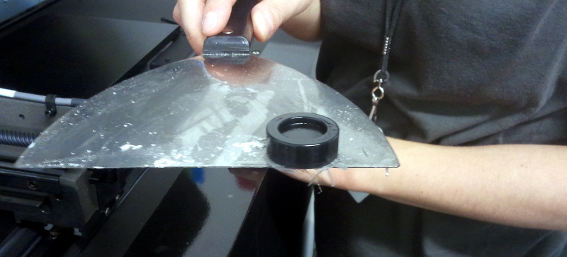
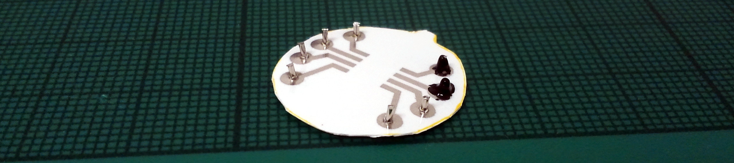
To work towards a functioning prototype, I laser cut acrylic to play the role of the PCB.

Laser cut insert

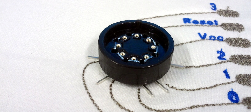
After discussing the prototype with Andrew, he pointed out that the button hole could cause too much mechanical strain on the socket legs. The stitching holding the legs in place was the only physical connections holding the button in place. To improve this, we added holes to allow the button to be stitched to the fabric directly. They were placed slightly outside the sockets so that the thread could provide a mechanical strain-relief for the socket legs.

The print below uses the gloss effect in the same rubber-like plastic as the print in the photo above. The gloss effect is achieved by not surrounding the object in the support print material, but using it only where structurally necessary.

3D printed button

Milled PCB

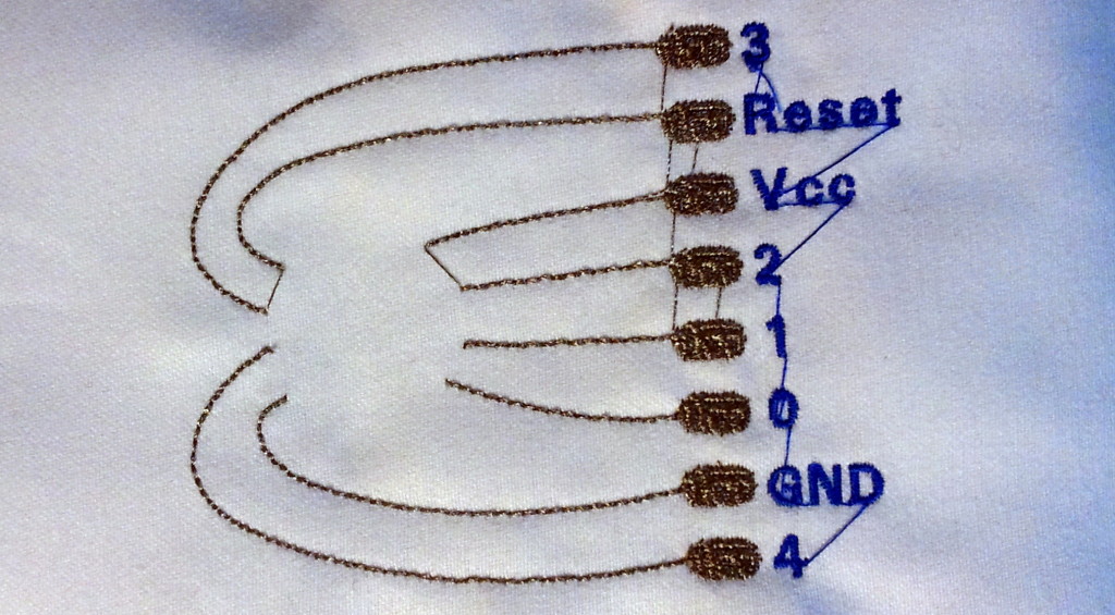
It was then time to move on to the PCB prototype. I created the design in EAGLE – with assistance from Andrew as I am far from fluent with that software tool. The PCB was then milled on the LPKF S103 PCB Mill located in the Electronics Lab at Queen Mary. Below is a PCB as it came off the milling bed on the right and after some sanding on the left.

PCBs

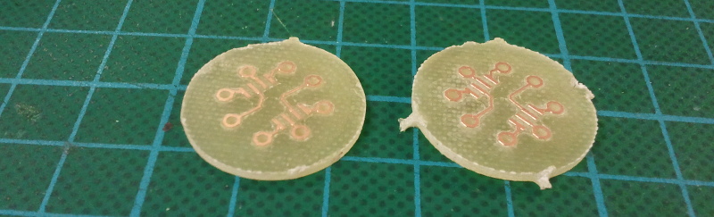
The PCB fit cleanly into the 3D printed button with all the holes lining up as they were supposed to. However, the inserting and removing the PCB and pins into the sockets highlighted a number of weaknesses in the design.

Reflections on Iteration 2

The printed material wasn’t adhered to the sockets in any way; the sockets were held in place only by the friction of the socket housing against the printed holes. The insertion and then removal of a pin into a socket caused the socket to pull away from the button.

The legs of the sockets were bent so the button could sit against the fabric, but they weren’t formed into a shape such as a loop. This meant that the force of removing a pin from the socket could cause the leg to be slid out of the stitching holding it in place.

Lastly, the 3D print material couldn’t withstand a shearing force where the rim that holds the PCB in place meets the main body of the button. The rim quickly fell apart, though anecdotally, the glossy finish seems to hold together better than the matte.

These concerns will be addressed, and hopefully improved upon, in the next and final design iteration of the project.

Button at end of iteration

Creativeworks London Project – Iteration 1

Selection of chip holders

I’ve started referring to electronics connected to soft sensors and hidden on a PCB in a pocket of a garment as the “pocket of shame”. By no mean do I mean any shame on the designers and engineers who were forced to place their circuitry in a pocket, but that it’s a shame we haven’t found a better solution. Beautiful, tactile, and flexible, textile electronic sensors can be woven, knit, or stitched into clothing, but the circuitry needed to process the data generated by those sensors or to send that data off to be processed on another device, is still often mounted on rigid PCBs.

This past October I started a short research project funded by the Creativeworks London Entrepreneur-in-Residence Scheme at the School of Electronic Engineering and Computer Science at Queen Mary University of London. I’m exploring how PCBs can be better integrated into garments with soft sensors, not by trying to transform the PCBs into something flexible, but by hiding them in the already “hard” parts of a garment – buttons.

I’m working with Andrew McPherson, a Senior Lecturer at QM, and Berit Greinke, a PhD student and lab technician in the Materials Processing Lab. We are using the rapid prototyping facilities available in the School to create buttons that are inspired by the chip holder/adapters shown in the photo above. The idea is to create a housing that can be sewn to a garment (with both conductive and non-conductive threads) that remains in place whilst the PCB it houses can be removed.

The Housing

The first design iteration has been focused on a SOIC package of an ATtiny and using the tools with the smallest barriers of use, whether cost, bureaucracy or my own skillset.

Laser cut rubber

Rubber for laser engraving

The housing has been developed using laser cut and etched rubber to make a recessed area for the PCB to sit in with 8 holes for pins to make contact with the PCB and fabric sensor.

The Circuit

The circuit was printed on paper using a Brother DCP 145C and silver nano particle ink.

I used clipped sewing straight pins as the contacts as they have broader flat heads that sat against the underside of the paper. They pierced the paper and then were electrically connected to the printed circuit with Bare Conductive Electric Paint.

The Fabric Connection

The remaining piece is the fabric circuit that the button interfaces with. With much training and assistance from Berit, I designed and embroidered a breakout circuit for the button to be sewn onto.

A Brother Pr1000e was used to embroider the circuit with Shieldex 110f 34dtex 2 ply yarn by Statex. It’s mostly done automatically, but some care needs to be taken to manually stop the machine’s thread cutter from trying to cut the conductive thread.

Here is the circuit when it comes off the machine, before trimming all the threads (which is something that can be programmed into the design for the machine to handle, but I hadn’t tackled that yet as this was my first time working with the software).

And here it is with the laser cut housing sewn in place. I used sewing straight pins to piece the rubber and then clipped the ends and formed them into loops.

Button on sewn circuit

The ATtiny was cold soldered into place on the circuit board with Bare Conductive Electric Paint and the circuit board placed in the holder.

Button on sewn circuit

A second piece of rubber served as a means to hold the circuit board in place.

Button on sewn circuit

Reflections on Iteration 1

The prototype button is able to make an electrical connection ranging from 30 to 80 Ohms of resistance from the chip leg to the sewn breakout pad. However, it is not a stable connection, but rather fragile both due to the materials and how the “sandwich” of layers meet each other.

The ability to so quickly make physical prototypes was incredibly useful, even though they are certainly not the best materials and tools to be used for the final version. Now that a general form factor has been settled on, the next iteration will utilise the 3D printer instead of laser cutting and a milled PCB instead of a printed paper circuit board.

The use of straight pins as electrical contacts were convenient as they were readily available in the lab, but won’t be used in future iterations. Another solution needs to be sourced, probably by perusing electronics components catalogues.

5 Years

My brain hurt like a warehouse, it had no room to spare
I had to cram so many things to store everything in there

Five years ago, well a couple weeks shy of five years, I began my PhD research under the supervision of Mark Sandler at the Centre for Digital Music (C4DM) in what was then the Department of Electronic Engineering at Queen Mary, University of London. We were a group of 30 or so researchers spread across two offices with a shiny new Listening Room to use in our research.

C4DM in November 2009

C4DM in November 2009

Now we’re something closer to 60 researchers associated with the group spread across four offices (once the construction dust is settled on the new office space). We are also now a part of the School of Electronic Engineering and Computer Science and within qMedia. Along with the Listening Room is a new Control Room and Performance Lab to be used with the Media Arts and Technology doctoral training centre.

Rocking out in the Listening Room

Yves and Matthias in the Listening Room in April 2007. Not many people know this, but Yves is a particularly talented trumpeter.

This September will commemorate 10 years of C4DM as a research group, and it will be the first September since 2005 that I will not be a researcher within it. I submitted my PhD thesis in July 2010 and have been a postdoctoral research assistant since then. It’s been an amazing time, but universities need turnover – they thrive on a continuous flow of new people with new talents and passions – so it is time to move on.

Presentations on MIR to the public at the Dana Centre.

Presentations on music information retrieval to the public at the Dana Centre as part of the OMRAS2 project in 2008. Photo taken by Elaine Chew.

I’m not going very far (in fact I’ll be back tomorrow for a meeting), but it still feels like a significant change. I’m not ready to publicly announce my next steps, but I’m happy to talk with you in person about what exciting things I will be up to past August. I’ll be talking about my new venture at the C4DM 10th Anniversary Event: Past, Present and Future, so come along to that! Even if you’re not bothered about what I’ll be up to, come along anyway! There’s also an evening event.

C4DM stand at the Big Bang in 2010

The C4DM exhibition stand at the Big Bang Science Festival in 2010.

Goodbye, C4DM!

Why MIR Researchers Should Care About User Experience

I’m at NYU for a couple months to conduct a rather large user study on an interface that I’ve developed. I talked about my PhD work and my current work with a gathering of PhD and MS students last week. I’ve included my slides below, though we didn’t really go through them. It’s an updated version of a talk I gave at a couple universities last autumn.

On a related note, if you look around and find that it’s June and that you seem to be in New York, why not contribute 2 hours towards science? You’ll even get a shiny $20 bill in return. Go here for more information.

Some good discussion ensued and it helped me solidify my own thoughts, particularly as to why MIR researchers should care about user experience. To people within HCI or UI/UX or design fields, to not consider the end user seems like a ridiculous notion, but it’s unfortunately an issue that’s only beginning to be addressed.

I talked with a couple researchers that are working on an interface for a library’s music collection. As we discussed ideas and played the game of “oh, have you heard of ______, let me google that and find it for you,” it was admitted that they didn’t actually know why or how users use would the interface they were creating. They didn’t know what are the most common tasks that a patron of the library’s music collection is trying to accomplish. They said the librarians weren’t even sure. One of the researchers I was speaking with said that in his undergrad he spent a lot of time on ethnographic study and user-centered work, but that the work he was doing now was much more focused on the engineering. Unfortunately, I think that means that they’ve developed a piece of software that might not be useful to anyone.

If every researcher has a platform that they like to shout from, these are the main placards I would display around my soapbox:

  • The data should not dictate how people interact with that data, people should dictate how people interact with that data. My pet peeve is that just because you can project a multidimensional timbre space onto two dimensions doesn’t mean you should. At the very least you shouldn’t force a user to interact with it.
  • Don’t kill new products by letting the first release be your first user testing. Genius had negative reactions when it was first released, and I don’t think I’m the only person that abandoned it after some poor recommendations. Google Music is now facing very public discussions of poor performance that perhaps could have been addressed through some private studies before a semi-public release. If something doesn’t work right away for a user, then you may have lost them forever.
  • Users can tell you which 1% problems to focus on. If the end user can’t perceive any difference in the 1% increase in the performance of your algorithm, perhaps it was a wasted effort. There could be a 1% increase in another aspect of the system that would actually improve the system as a whole.

My current work is attempting to address how a small collection of music (e.g. a list of search results returned from a query) can be best presented to a user. I’m doing this without considering a specific MIR backend – I want to separate how the user interacts with the data from how that data was collated. It’s a very specific use case, but because of that I think it’s one that can be easily improved. I’ll certainly be posting more about it as the work is completed.

One in a Million

So I’m designing an experiment. I have an interface. I think it’s really neat, but would like to measure the best way to use this interface and try to quantify its neatness factor. I don’t want to tell you exactly what it is, because you might be a participant in my user study and that could muck around with the results. Suffice it to say that this is an interface for music search and browsing.

When I say it’s an interface for search and browsing, I don’t mean it performs a query. It is only a means to navigate a collection of music. How that collection of music has come into existence is someone else’s business. I just want to help people interact with a collection, in this case smaller collections. The idea is that someone performed some kind of query on the world of music and has a small (< 50 songs) set of songs that they want to traverse through in an efficient manner.

The Problem

I need a several sets of songs in order to perform my user study with my interface. Participants will be searching for specific songs and browsing for songs that fit a written description. As this is an interface for music search and browsing, I think that those sets of songs should be thoughtfully chosen.

I need

  • 6 sets of heterogeneous songs.
  • 10 sets of homogeneous songs so that there are 2 sets of a single “genre” for 5 “genres.”
  • All sets needs to be unique and no song appears in more than 1 set.
  • The sets have no order.
  • There will be approximately 30 songs in a set. This may change slightly after some pilot studies, but it shouldn’t change significantly.

Heterogeneous songs are songs that are as different as possible in timbre and musical style. I want as little similarity between songs within a heterogeneous set as possible.

Homogeneous songs are songs that are as similar to the other songs in the set as possible. This includes notions of “genre” and timbre. I want songs that are similar in signal content and musicality.

I want to use songs that are from the Million Song Dataset. I want this to be reproducible research, and I want to use a dataset that will overlap with other studies. Plus, the 30 second audio clips are exactly the audio content I want for the study – I don’t want full songs.

So I want to know how do I choose my 16 sets of music from the million available songs? I don’t want to write a lot of code – I’m not interested in this selection as a research question. I just want to do it and have it be reasonable. I’d like to use a combination of the Echo Nest API and the sample code for the Millon Song Dataset, but pointers to other useful bits of code will be appreciated as well.

My two main questions are: how should I choose my song sets and what “genres” should be represented?

21 Ways to Listen to Your Music

There may be 85+ ways to visualize your music, but there are also 21 ways to listen to it. This is the first of what will be a series of posts summarizing some of the content of my PhD thesis. My whole thesis will eventually be available here after my viva.

I’ve gathered a list of interfaces that help explore a collection of audio. The primary focus is on interfaces which use spatial audio, but I have included some interfaces with interesting design ideas that don’t use spatial audio though use audio playback in an innovative way. The earliest work focuses on efficiently browsing speech signals while later work focuses on presenting multiple music streams at the same time, usually by sonifying a 2D arrangement of music. Some of the most recent work looks at using virtual 3D worlds to explore music as an individual or collaboratively. Continue reading

Map to Santa's House

For the DMRN day in a little over a week, I’m using a Christmas-themed data set for my audio collection browser demo. Mostly because this is a workshop 3 days before Christmas.

I’ve grown quite frustrated with automatic arrangements of songs, at least based on content analysis. Metadata-based techniques can be better, but you run into problems with long-tail content and it’s difficult to arrange individual songs, you’re usually only getting reliable results at the artist level. Audio-only interfaces are very fragile; they need to be robust and intuitive or users get confused. This means that it needs to be obvious why songs are where they are. So since I’m using a small handpicked set anyway, I’m just going to arrange them by hand as opposed to automatically by some algorithm.

These are the 44 tracks (with SoundCloud or last.fm links where possible):
Blue Christmas – Elvis Presley
Carol of the Bells – uploaded by stretta on SoundCloud
Cha-Cha All the Way – Capitol Studio Orchestra
Chilly Winds Don’t Blow – Nina Simone
Christmas Is – Lou Rawls
Christmas Kisses – Ray Anthony
The Christmas Song – Mel Torme
The Christmas Song – Nat King Cole
Christmas Trumpets/We Wish You a Merry Christmas – Ray Anthony
(Everybody’s Waitin’ For) The Man with the Bag – Kay Starr
Frosty the Snowman – uploaded by Jofro on SoundCloud
God Rest Ye Merry Gentlemen – Jimmy Smith
Good Morning Blues – Count Basie
Holiday on Skis – Al Caiola and Riz Ortolani
I Am Blessed – Nina Simone
I Saw Mommy Kissing Santa Claus/Jingle Bells Bossa Nova – Eddie Dunstedter
I’d Like You for Christmas – Julie London
I’ll Be Home for Christmas – Elvis Presley
I’ll Be Home for Christmas/Baby It’s Cold Outside – Jackie Gleason and Jack Marshall
I’ve Got My Love to Keep Me Warm – Billie Holiday
I’ve Got My Love to Keep Me Warm – Dean Martin
If Everyday Was Like Christmas – Elvis Presley
It’s Christmas Time, Pretty Baby – Elvis Presley
Jingle – uploaded by DJD MUSIC on SoundCloud
Jingle Bells – Johnny Mercer
Jingle Bells/Jingle Bell Rock – Hollubridge Strings
Last Christmas – uploaded by amysue on SoundCloud, by Amy Subach
The Nutcracker Suite – Les Brown & His Band Of Renown
Ring Those Christmas Bells – Fred Waring & The Pennsylvanians
Rudolf the Red-Nosed Reindeer Mambo – Alvin Stoller
Rudolph the Red Nose Reindeer – uploaded on SoundCloud by nickmcIntyre
Run, Run Rudolph – uploaded on SoundCloud by rnbmama
Santa Claus is Coming to Town/White Christmas – Jimmy McGriff
Silent Night – Dinah Washington
Silver Bells – uploaded by amysue on SoundCloud, by Amy Subach
Toys for Tots – Peggy Lee
What a Wonderful World – Louis Armstrong
What Are You Doing New Year’s Eve? – Ella Fitzrgerald
What Are You Doing New Year’s Eve? – Nancy Wilson
White Christmas – uploaded by amysue on SoundCloud, by Amy Subach
White Christmas – Elvis Presley
Winter Wonderland – Peggy Lee
Winter Wonderland – Shirley Horn
‘Zat You, Santa Claus? – Louis Armstrong

What I really like about this collection is that it’s music that I’d enjoy to discover. Yes, there are a ton of terrible (Christmas) songs, but why would you want an interface to “discover” them?

So how would you arrange this music? What would make sense to you? I’m thinking something like one dimension being upbeat songs to slower, low key songs versus a second dimension of large orchestrated pieces to smaller instrumentations. So the four corners of the above list would be something like: What a Wonderful World (big instrumentation, low key song), a guitar/vocal version of White Christmas (small instrumentation of low key song), Jingle Bell Rock (big instrumentation of upbeat song), and guitar/vocal Rudolph the Red-Nosed Reindeer (small instrumentation of upbeat song). But there are also a number of different version of the same song and common styles, like latin beats or big band or only instrumental, that could instead influence the arrangement.

Changing the arrangement of the songs is not difficult and can be done up to the day before DMRN, so let the suggestions flow. How would you arrange these songs in two dimensions?

A Room of My Own

Right now in my literature review I’m interested in why researchers want to create virtual acoustic environments. It’s not difficult to find incremental research improving a particular model or testing the psychoacoustical limits of a technique, but it takes more effort to determine why the researcher cares. I’ve found several common motivations and have highlighted some key examples, though I add the disclaimer that much more has contributed to the field than is mentioned here.

Architects and Those That Hire Them

Big money is invested in new performance spaces and investors like to have a guarantee that their money will be well spent. Initial auralization work was done without the assistance of computers. Acousticians would make tiny scale models of spaces and study how sound waves would travel around the model in hopes of extrapolating what would happen in full-sized rooms. This work is now done with computer models by studying the physics of how sound travels and interacts with objects. Two of the major software packages used are CATT-Acoustic and Odeon. Though computers can create very complex models to precisely predict how sound will move throughout a space, the limitation is that the sound cannot be rendered in real-time. Moving and listening through a space cannot be modeled in an interactive manner. CATT-Acoustic is addressing this issue by looking at rendering the data required to compute the audio offline so that some amount of movement can be approximated. However, the approach they are taking, computing a large number of impulse responses calculated by the CATT-Acoustic software, requires a large amount of data storage.

Education and Posterity

The field of archaeological acoustics has grown in recent years as researchers have began to discover similar aural phenomenon across multiple archaeological sites. The questions then emerge: did previous civilizations have an understanding of acoustics; were these acoustic phenomena intentional design features; did these phenomena have a direct impact and role in the society such as in religious ceremonies? (The third chapter in Spaces Speak is an excellent reference on the subject.) Engineers approach these questions by meticulously measuring the spaces so that the spaces can be auralized and further studied.

More recently, audio engineers have acknowledged a need to preserve and record spaces of significance such as famous concert halls. Angelo Farina (see this paper in particular) and Damian Murphy have been two of the researchers actively trying to accurately capture and then model acoustic spaces of some historical note.

I attended the Audio, Acoustics, Heritage Workshop in 2008 which addressed a lot of these issues. I was particularly interested in the work presented by Gui Campos from the University of Aveiro in Portugal. The Painted Dolmen (Anta Pintada) is a neolithic site in Portugal with fragile paintings which have already been significantly damaged in previous archaeological excursions, so it is not open to the public. The Portuguese government wanted to create educational tools so that the public could still experience the heritage site without causing further damage. This seems to be an increasingly popular enterprise for governments, both the British and Italian governments have funded similar projects.

Researchers from the University of Aveiro used a laser scanner to precisely measure the space and then model it for virtual reality simulation. Though the data existed to create a complex, detailed model of the space, it could not be auralized in real-time, so a simplified model was instead implemented. A similar application was developed for an archaeological park in Italy using GPS and custom software for mobile phones (see the paper for details). The researchers found that including sounds to recreate the soundscape was well-received by the students that tested the system. However, even though they have 3D models of the ruins, they did not use any auralization, real-time nor previously rendered.

Entertainment

Interactive 3D environments are becoming increasing common and complex for the average consumer as video game hardware advances. A PS3 and a 5.1 surround sound systems trumps most research setups of the past decade. An enclave of the industrial and academic research lab is the CAVE. CAVEs are immersive visual environments that can use loudspeaker or binaural (headphones) technology for audio playback and usually have projected images that encompass an entire room. There are a number of applications that have been developed for CAVE-like environments. You can find a description of several different applications here.

The Acoustics research group at the Helsinki University of Technology developed at system at the turn of the century called DIVA (Digital Interactive Virtual Acoustics). It models performing musicians and allows a listener to move virtually around them while listening to their performance. The major compromise in such systems is accuracy for interactivity. It is deemed more desirable to have an immersive, engaging virtual system which only approximates a space that might exist in reality rather to be hung up on details and causing longer processing times. This is approach taken in all video games: perceptual approximation overrides absolute reality.

What Conclusions Can We Draw?

Applications using virtual acoustic environments are being developed for differing end-users with priorities ranging from high-precision acoustic recreation with a lesser focus on interactivity to a large focus on interactivity at the expense of accurate acoustic models. In between is the emerging field of edutainment which hopes to use the interactivity of virtual environments to attract and teach students about specific acoustic environments. The signal processing is falling short though. While great advances are being made in auralizing 3D models of spaces, complementary technology has not been sufficiently developed to aid in the real-time interaction with this data.

A visual parallel is computer animation. Feature-length films are created in non-real-time by the computers that are rendering the images as opposed to video games which require the hardware to produce images as the player moves in the game. The visuals in video games do not look as good as movies, but they are quickly approaching that quality as the hardware improves. The same is true of virtual acoustics, high-quality audio can be rendered offline, but it is only a matter of hardware in order for real-time, interactive audio of the same quality to be generated.

For the time being, clever algorithms need to decrease the need on heavy processor loads and large amounts of data so that high-quality, interactive audio can generated on mobile devices. A significant portion of my PhD work looks at efficiently summarizing and interacting with a large database of impulse responses, the data that generates the audio of a 3D model, so that lightweight applications can be created without compromising the audio quality of the original 3D model. I am also looking at clever ways of compressing the data so that less storage is required.

You want the third song on the left.

Researchers working with large collections of music really really like to take those collections, stare at them cross-eyed and then push them onto a two-dimensional map of some sort.  If you don’t believe me, go here for 30 seconds and then we can continue.

A lot of the resulting visuals are beautiful and can be informative. Some look like 1994, but we’ll just assert that’s an intentional retro design aesthetic that was carefully perfected.

The thing is pretty pictures can only serve so much purpose. You’re still dealing with music and music needs to be heard. I’m interested in how interactive audio, primarily but not exclusively spatial audio, can be used to enhance or even replace some of these elaborate visuals.

One tool I’m currently messing around with is spatial databases for fast querying of spatial data.  I’ve just finished setting up a postgresql database  that is spatially-enabled (everyone loves enablers) with postgis.

I have a collection of about 50,000 tracks that have been analyzed by SoundBite. As a part of his MSc research at QM, Steve Lloyd took the feature vectors computed by SoundBite and arranged the 50,000 tracks on a 2D map. He used Landmark Multidimensional Scaling (LMDS) with 1000 randomly selected landmark points. He also fixed the maximum track-to-track dissimilarity to a ceiling to prevent outliers from ending up too far from the main group of tracks. So in summary, I have a collection of 50,000 songs, all the associated metadata, the audio content, and (x,y) coordinates placing each song on map.

So, a short tutorial on how to create a spatially-enabled database:

  1. Install a database and the required dependencies.  I’m using postgresql with postgis which requires Proj4 and  GEOS.  But there are other options.
  2. Create the database and set it up for spatial queries. At the command line:
    createdb [yourdatabase]
    createlang plpgsql [yourdatabase]
    psql -d [yourdatabase] -f postgis.sql
    psql -d [yourdatabase] -f spatial_ref_sys.sql

    If you used macports, you will find the sql files in /opt/local/share/postgis.

  3. Create table to hold any metadata.  In psql:
    CREATE TABLE mytable(id integer, track_name text);
    Note the semicolon, the statement won’t execute without it.
  4. Add a spatially-enabled column to hold the coordinate information.
    SELECT AddGeometryColumn('', 'mytable', 'mygeocolumn', -1, 'POINT', 2);
    The arguments are:

    • The schema name, we don’t use one here and could have used only 5 arguments.
    • The table name.
    • The new column’s name.
    • The SRID, a reference to mapping system to use, -1 means we aren’t using a pre-defined system.
    • The type of geometry.
    • The number of dimensions.
  5. Now to start inserting data into the table. This can be done row-by-row by through the insert command:
    INSERT INTO mytable(id, name, mygeocolumn)
    VALUES (1, 'First Song', ST_GeomFromText('POINT(0 5)', -1);

    ST_GeomFromText will create the proper datatype. Note that there is only a space between the two coordinate values.

  6. It’s likely that you don’t want to type out every individual track.  In my case that’d be 50,000 entries to process by hand.  Instead use the copy functionality by creating a text file describing the tracks and then copy that file into the table.  This has the benefit of letting postgres check things like primary keys so that the table isn’t half-built when an error is encountered leaving you with half a table.  Instead it’s all or nothing.  It’s fairly simple to create a text file according to whatever delimiter you’d like; it’s all well documented.  However, I had a problem trying to import geometry data.  This is the fix I found.  I make no guarantees that it won’t break something, but it has worked out for me so far.  In the text file, define the Points as:
    SRID=-1;POINT(6 10)
    Then to copy the text file into a table using a tab as the delimiter:
    \COPY mytable FROM '/the/path/to/myfile.txt' WITH DELIMITER E'\t'
  7. To take advantage of the postgis, you need to compute the spatial indices.
    CREATE INDEX myindexname ON mytable USING GIST(mygeocolumn);
    VACUUM ANALYZE mytable(mygeocolumn);
  8. Query away.  See the PostGis docs for tips on efficient querying, but here’s an example of finding all tracks that are within 10 units from (3,4).
    SELECT ST_AsText(mygeocolumn) AS location FROM mytable
    WHERE ST_DWithin(mygeocolumn, 'POINT(3 4)', 10.);